
IndiGo evaluation
Usability and accessibility evaluation of an airline booking site
2025 · 11 weeks · 5 phases
- My role
- Heuristic evaluation, cognitive walkthrough, test plan and task scenarios, moderation and observation of remote sessions, synthesis, keystroke-level model, and the WCAG 2.1 audit.
- Team
- Lead researcher, with two researchers supporting the moderated sessions. Four of the six methods were run solo. DePaul University.
- Full work
- Read the usability report (opens in a new tab) Read the accessibility report (opens in a new tab)
Four of five could not find what an extra bag costs. Most still rated the site easy to use.
01 Context
One site, three tasks, and a reason to distrust the first impression
IndiGo is India’s largest low-cost carrier, and the only one flying both domestic and international routes at that scale. The website carries the whole service counter: booking, seat selection, meals, baggage, check-in, boarding passes, refunds. For most of it there is no phone line a traveller would rather call.
I picked this site because I failed on it myself. I was flying back to the United States and needed a domestic connection, and I wanted to add a bag to that leg. The site looked clean and modern and I still could not do it. The labels did not say what they meant, and the flow broke halfway through.
That gave me something worth testing properly. This interface is good at looking usable, which is a different thing from being usable. I built three tasks to press on that, all from one traveller scenario: a student flying Mumbai to Chicago for the first time, comfortable booking domestic flights, new to long-haul.
Find the cheapest flight. Download a boarding pass for a booking that already exists. Work out what 15 kg of excess baggage costs on an international connection. The first task is the one the site is built to sell. The other two happen after the sale, where nothing about the design is earning money any more.
02 Method
Six methods, because no single one of them would have caught this
I ran the predictive methods first to work out where to look, then watched people, then measured the one flow that had seemed fine.
| Phase | Method | n |
|---|---|---|
| 01 | Heuristic evaluation against Nielsen’s ten heuristics | – |
| 02 | Cognitive walkthrough, three task flows, four questions per step | – |
| 03 | Moderated remote usability sessions, 20 to 30 min | 5 |
| 04 | Post-task and post-test questionnaires | 5 |
| 05 | Keystroke-level model, boarding pass retrieval | 5 |
| 06 | WCAG 2.1 audit across two pages | – |
The heuristic evaluation logged 73 issues across the home page, flight search, and booking. They were not spread evenly. Visibility of system status took 18 of them and consistency and standards took 12. Read together, those two counts say something fairly specific: the site rarely tells you what it is doing, and rarely calls the same thing by the same name twice.
The cognitive walkthrough broke the three flows into steps and asked the four standard questions at each one. Severity came out very different by task. Minor problems for flight search, major ones for the boarding pass, and a critical failure for excess baggage pricing. That spread is what made the usability test worth running. A method that predicts everything is equally mediocre cannot tell you where to spend five participants.
Five participants, aged 18 to 30, all of whom had booked a flight online in the past year and most of whom had flown internationally once or not at all. Sessions ran over Zoom with one moderator reading prompts and one observer logging actions, hesitations, and non-verbal cues on a structured sheet. I wrote the prompts so they never named a feature, which meant participants had to find their own way.
I saved the keystroke-level model for the task that had gone best. Three of five people had retrieved a boarding pass without much trouble, so that flow looked healthy. Modelling it was a way of asking whether it was genuinely efficient or only survivable.
The accessibility audit ran separately, months later, against the live site: W3C Easy Checks, an ARIA and semantic markup review in DevTools, WAVE and IBM Equal Access, a readability test, a mobile emulation pass, and a VoiceOver walkthrough on macOS. I did the second page with Screen Curtain on, so the screen was actually off.
03 Evidence
What the three tasks actually looked like
| Task | Completed | Avg. time | Rated |
|---|---|---|---|
| Find the cheapest flight | 2 / 5 | 3m 08s | 1.6 / 5 |
| Download a boarding pass | 3 / 5 | 1m 42s | 2.2 / 5 |
| Check 15 kg baggage cost | 1 / 5 | 4m 12s | 0.4 / 5 |
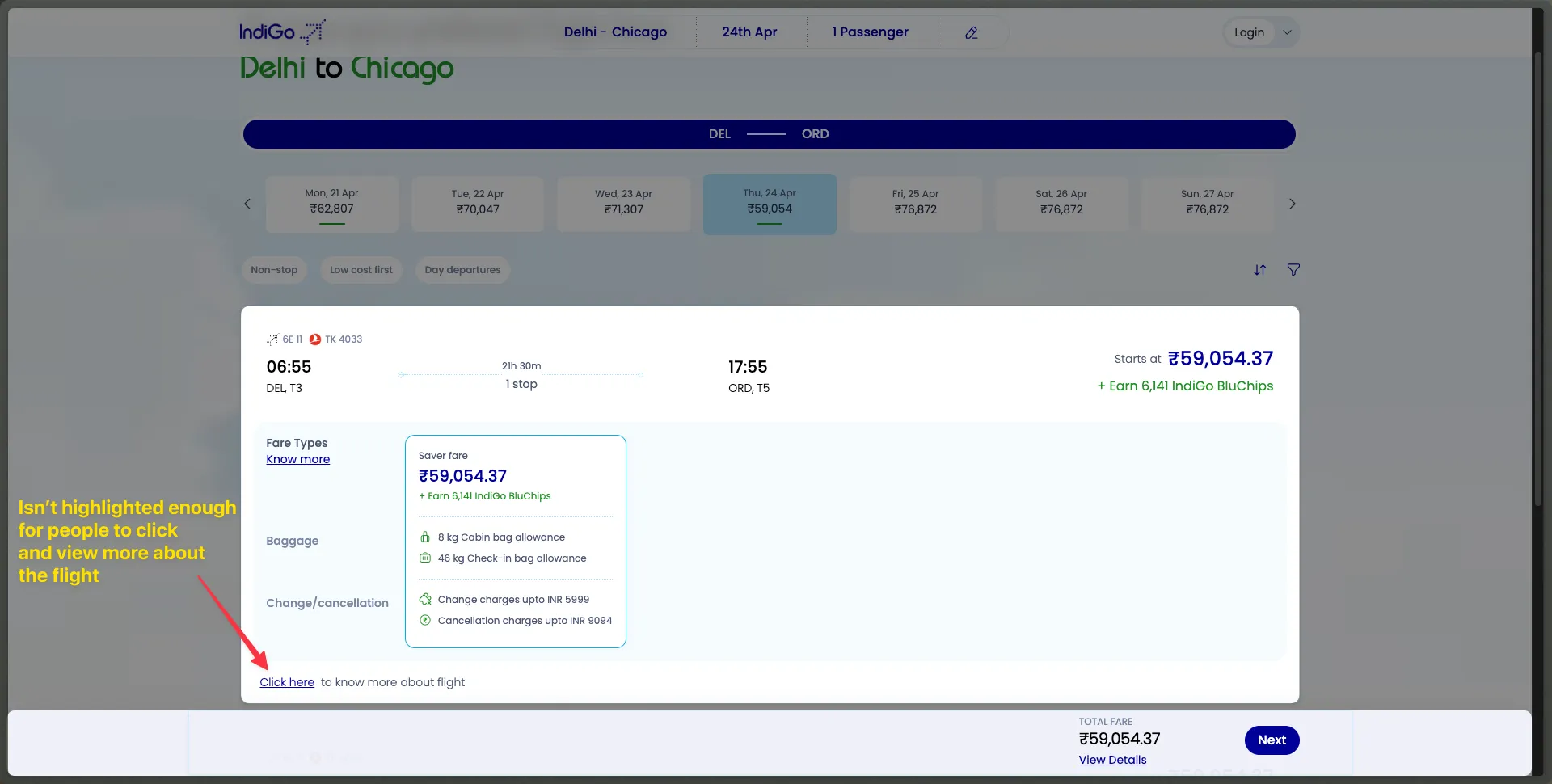
On Task 1, most people never saw the “Low Fare” filter that would have answered the question outright, and sorted by hand instead. P3 toggled between dates and missed cheaper options. P2 had the results on screen and still could not tell which one the task was asking about.
I see multiple results, but I don’t know which one is the lowest.
P2, on the flight results page
Task 3 is where it fell apart. Four of five people either gave up or landed somewhere that could not answer the question: the FAQ, the generic baggage policy in the footer, a domestic pricing table. Nobody found a way to filter by route.
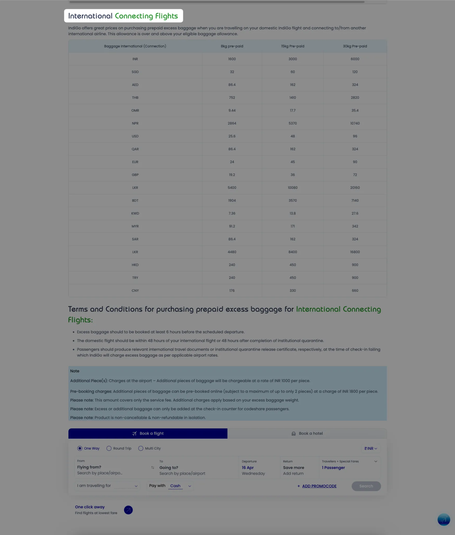
Is there any search bar to find this?
P4, mid-task, having scrolled the baggage page twice
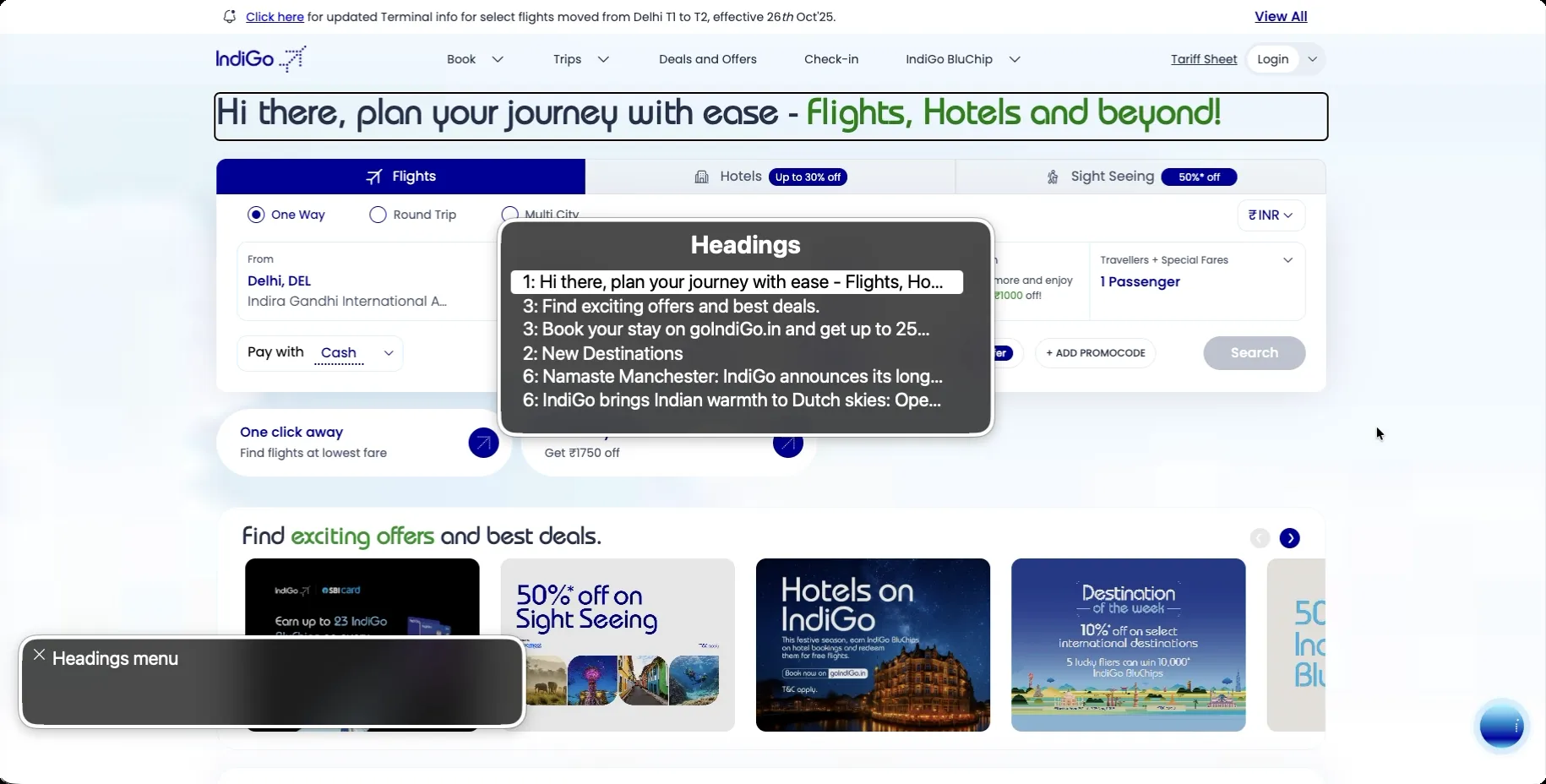
The accessibility audit turned up the same information problems, and worse, because a screen reader takes away the option of skimming past them. On the home page the heading order runs H1, H3, H3, H2, H6, H6. The rotor’s headings menu exists so a screen reader user can move through page structure, and here it hands back an outline the page does not actually have.
04 Synthesis
Four patterns that only appear when the methods are read against each other
What people said did not match what they did. Post-test ratings came back broadly positive. Participants called the site trustworthy and said they would use it again, including two I had just watched give up on a task. The same session produced a warm rating and a failure.
Rated usable → 1 of 5 completed
Excess baggage pricing: post-test sentiment against observed task success
That is not people being wrong about their own experience. Participants are polite, they remember the end of a session better than the middle, and someone who cannot find a price will usually assume they did not look hard enough. A survey on its own would have reported a usable product here. Watching is what separated the two.
The words broke people’s expectations. “Itinerary”, “Manage”, and “Find & View Booking” all failed to say what sat behind them. Two of five people trying to download a boarding pass were already on the right page and did not know it, because nothing on it used the words they had in their head. The vocabulary is consistent with itself. It belongs to the airline, not the traveller.
Density stops being an inconvenience and becomes a wall. The excess baggage page holds every price the airline charges, for every weight, in every currency, for domestic and international and connecting routes, on one scroll, with no filter and nothing to anchor to. Every fact a traveller needs is on that page. The cognitive walkthrough called it a critical failure before anyone tested it, and then four of five people failed it.
Missing feedback is what turned confusion into giving up. People asked out loud whether things had worked. “Am I done?” “Should I download this?” They asked after finishing steps that produced no confirmation of any kind. Not knowing whether a step worked is what sent people back to redo it, and redoing steps is where most of the time in Table 1 went.
Set against all that, the keystroke-level model of boarding pass retrieval is a useful corrective. Modelled cold, the happy path costs 26.1 seconds, and more than ten of those are the system thinking, across three page loads. After five practice runs I averaged 23.3 seconds.
26.1s modelled → 23.3s practised
Boarding pass retrieval, KLM prediction against five timed trials
So the flow is efficient once you know it. I read that as the problem rather than the defence. The task that looked healthiest in testing is healthy for someone who has already done it, and three page loads of dead time cost you nothing if you know a boarding pass is waiting at the end of them. Two of five first-timers never got there. Efficiency measured on a practised user says very little about a new one, and this is the clearest place in the study where two methods disagreed and both were right.
The accessibility failures were the same failures with the escape routes removed.
Keyboard focus got stuck in video playback controls and took a lot of keystrokes to get
out of. The airport dropdowns are built from div elements instead of form inputs, so
VoiceOver read them aloud but selecting from them was unreliable. Table headers were
announced twice and then not at all, so cells arrived as “cell 2 of 20” with no row to
attach them to, on a page that is almost entirely tables. Carousels announced themselves
as “Offer Slide”. The login button was labelled “Tariff Sheet Login”, which is a control
the page does not have.
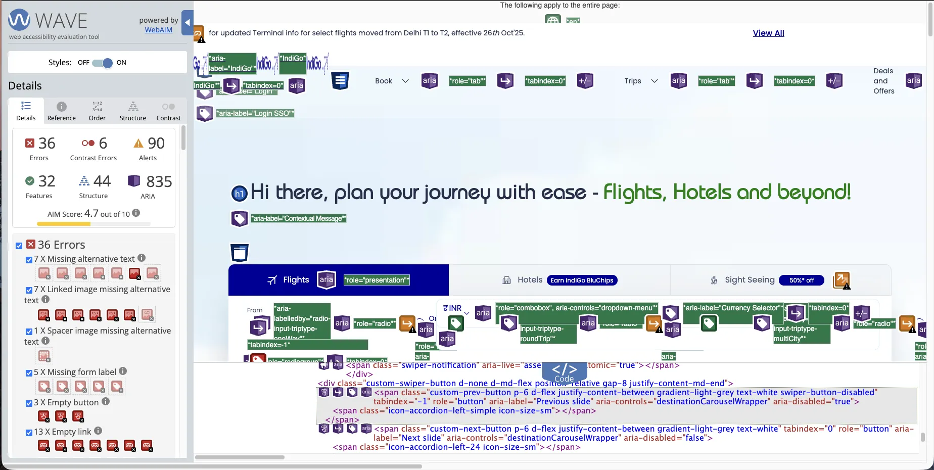
That same page carries 835 ARIA attributes. WAVE and IBM Equal Access flagged more than
50 of them as redundant or invalid: aria-label="Image Aria Label", roles stacked onto
elements that already had semantics, aria-hidden="true" on desktop elements that turn
visible and audible on mobile. Somebody spent real time on this and almost none of it
reached the user. ARIA was standing in for semantic structure, and for opening a screen
reader and listening to the result.
05 Recommendation
What follows for anyone shipping a self-service travel flow
These are not cosmetic problems, and they share a shape. The interface is built around the transaction that brings in money, and everything after that transaction gets whatever structure was left over.
| Principle | Rule |
|---|---|
| Name tasks, not systems | "Download boarding pass" rather than "Itinerary" or "Manage". A label earns its place by matching what the person came to do, not by naming the object behind it. |
| Confirm every completed action | Loading states during searches, and a plain success message after a retrieval. When nothing comes back, people read it as failure and pay for it by doing the step again. |
| Index reference data by the question asked | Baggage pricing gets looked up by route and weight, so let it be filtered by route and weight. Scoped headers, collapsible sections, and a search field, instead of one page holding every price. |
| Structure before ARIA | A correct heading order and real form controls carry more than 835 attributes. Add ARIA to fill a gap you have actually found, then check it with a screen reader rather than a checker. |
| Keep focus visible and escapable | Predictable tab order, a focus indicator you can see, no traps inside embedded media, and a pause control on anything that moves by itself. |
Four limits are worth saying plainly. Five participants is the right number for finding problems and the wrong number for counting how often they happen, so Table 1 shows that these tasks fail, not how often they fail. None of the five used assistive technology: the accessibility findings come from my own audit and my own VoiceOver walkthrough, which can find violations but cannot tell me what they cost somebody who depends on that software every day. The audit covered two pages rather than the booking, payment, and check-in flows. And the project diagnoses without validating a fix.
The next step is the one I cannot skip. Recruit screen reader and keyboard-only users as participants rather than as a standard to measure against, redesign the baggage and boarding-pass flows against the guidelines above, and test whether any of it moves completion. Particularly on the task where four of five people currently give up.
The work produced a usability evaluation report (opens in a new tab) covering the test plan, protocol, raw participant data, and annotated screenshots, and a separate web accessibility report (opens in a new tab) organised under the POUR principles.