
DrivAR
Augmented reality windshield navigation
2025 · 10 weeks · 5 phases
- My role
- Study design and protocol, simulator build, moderation of in-person sessions, thematic analysis, and Concept B.
- Team
- Four researchers. Capstone, DePaul University.
- Full work
- Read the full report (opens in a new tab) Read the slide deck (opens in a new tab)
Drivers failed to navigate an unfamiliar route from a static map. Every one of them completed it with guidance rendered on the windshield.
01 Context
Why head-up displays
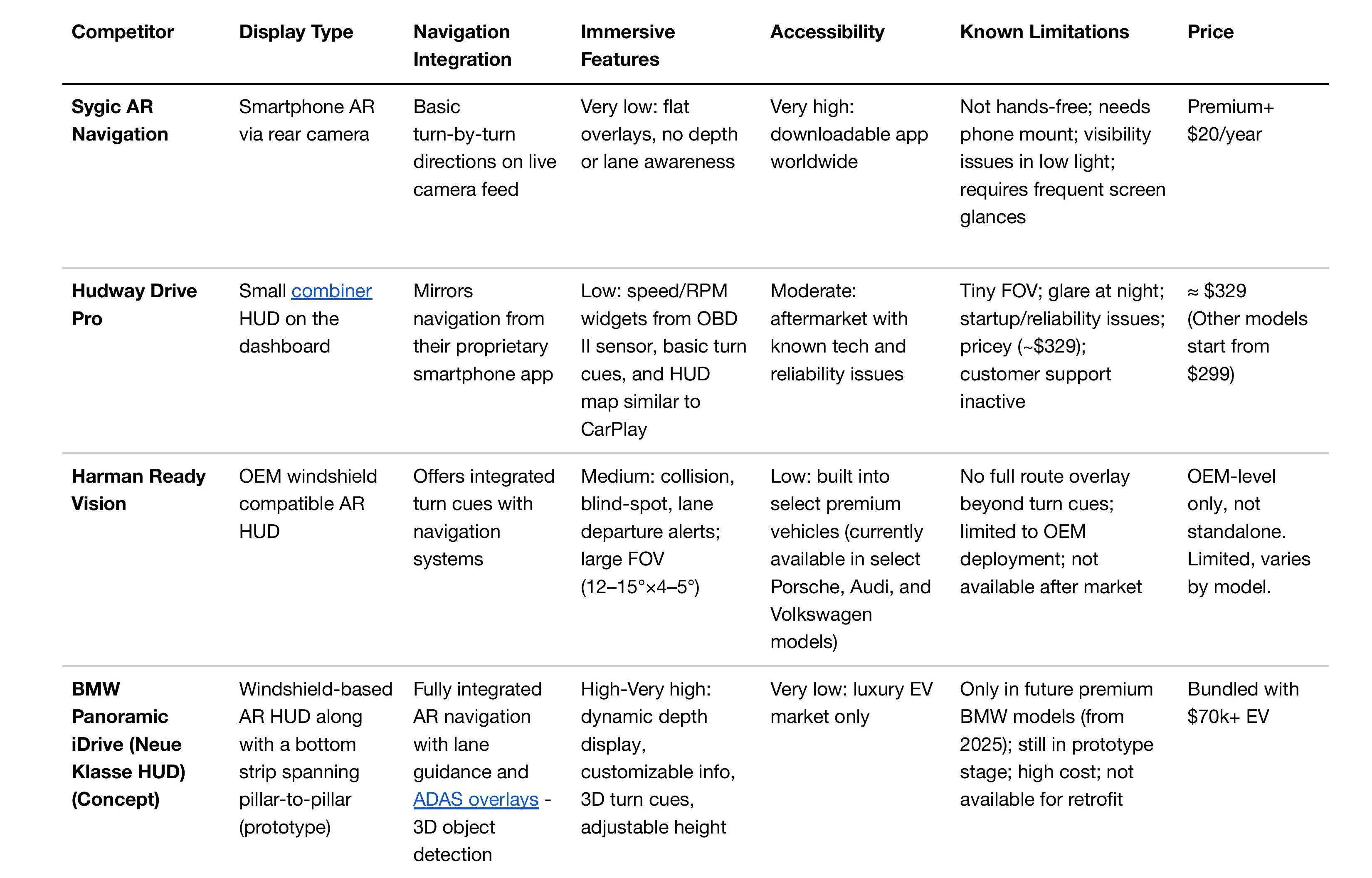
Phone-based navigation takes a driver’s eyes off the road at the moments that matter most, like a complex intersection or a merge that arrives with no warning. Carmakers are already shipping AR head-up displays into production cars, but very little has been published on how ordinary drivers want that guidance to behave.
We started with three questions. How do drivers deal with stress and uncertainty using the tools they have now? Could a windshield display reduce that, or would it just add more for them to look at? And what makes an overlay feel trustworthy instead of distracting?
02 Method
How the five phases ran
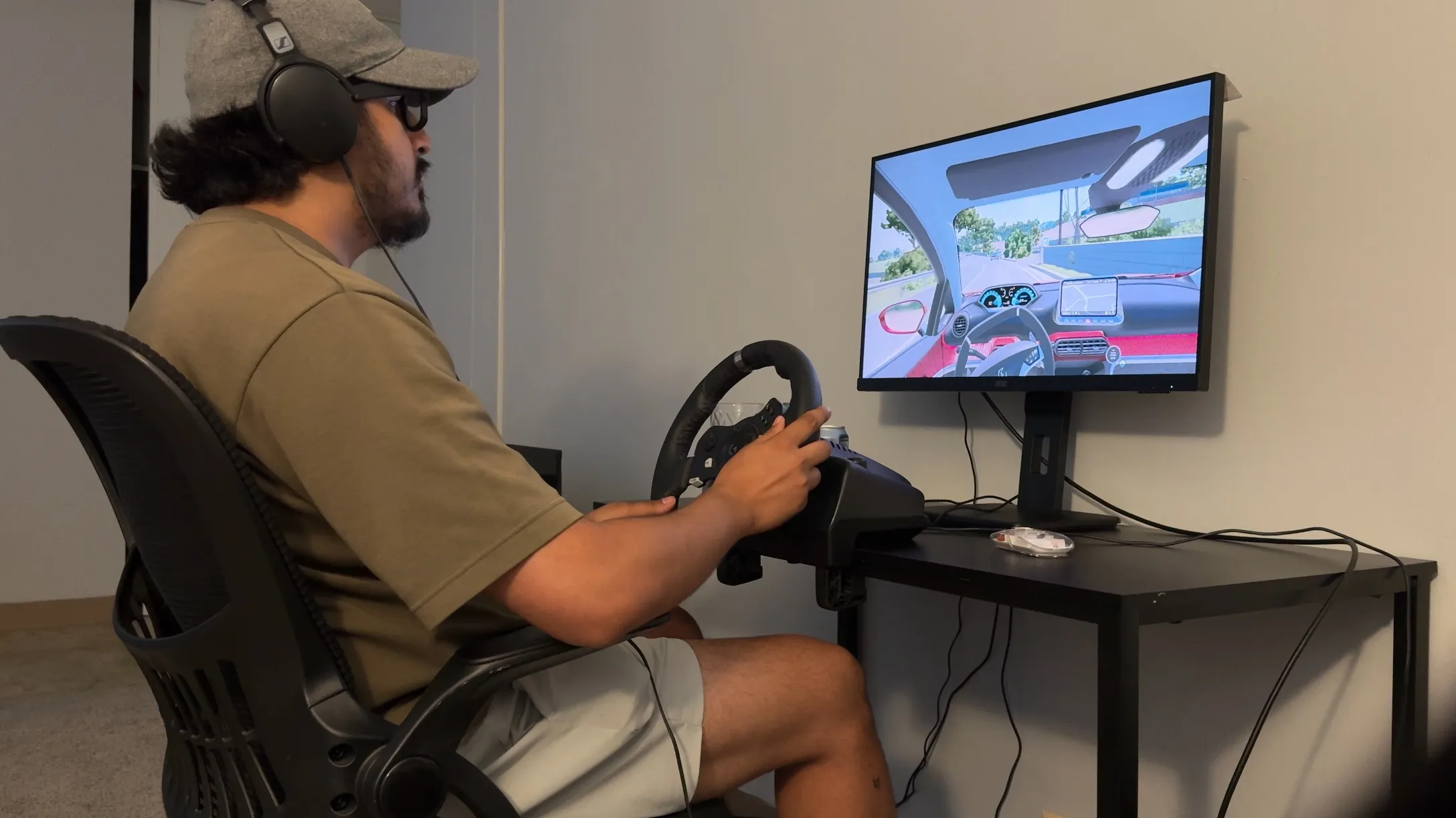
The team ran a cognitive interview first, to check the survey wording before we trusted it. Two licensed drivers read each question aloud and talked through what they thought it was asking. Several questions turned out to push people toward enthusiasm about new technology instead of their real safety concerns, so we simplified the wording and fixed the scale anchors. I built the simulator, moderated the in-person sessions, and led the thematic analysis.
The corrected survey went out next, then eight remote interviews about how people actually drive, then five in-person sessions on the simulator, then a comparison of the two concepts.
| Phase | Method | n |
|---|---|---|
| 01 | Cognitive interview | 2 |
| 02 | Exploratory survey | 15 |
| 03 | Remote semi-structured interviews | 8 |
| 04 | In-person simulator sessions | 5 |
| 05 | Comparative concept evaluation | 10 |
03 Artifacts
Two concepts, varied on purpose
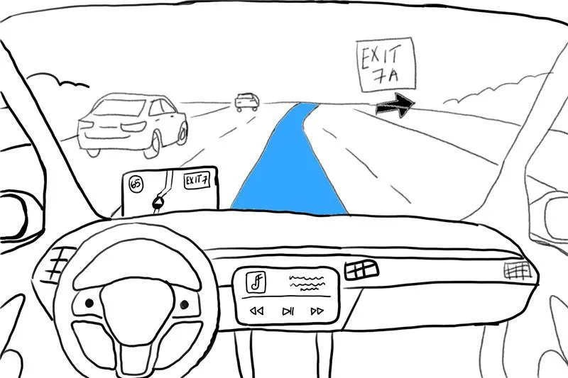
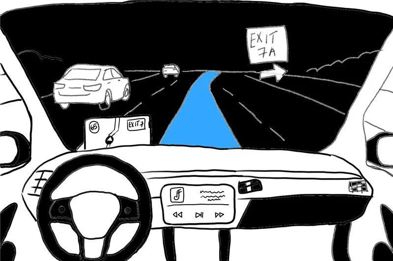
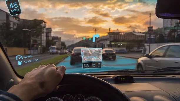
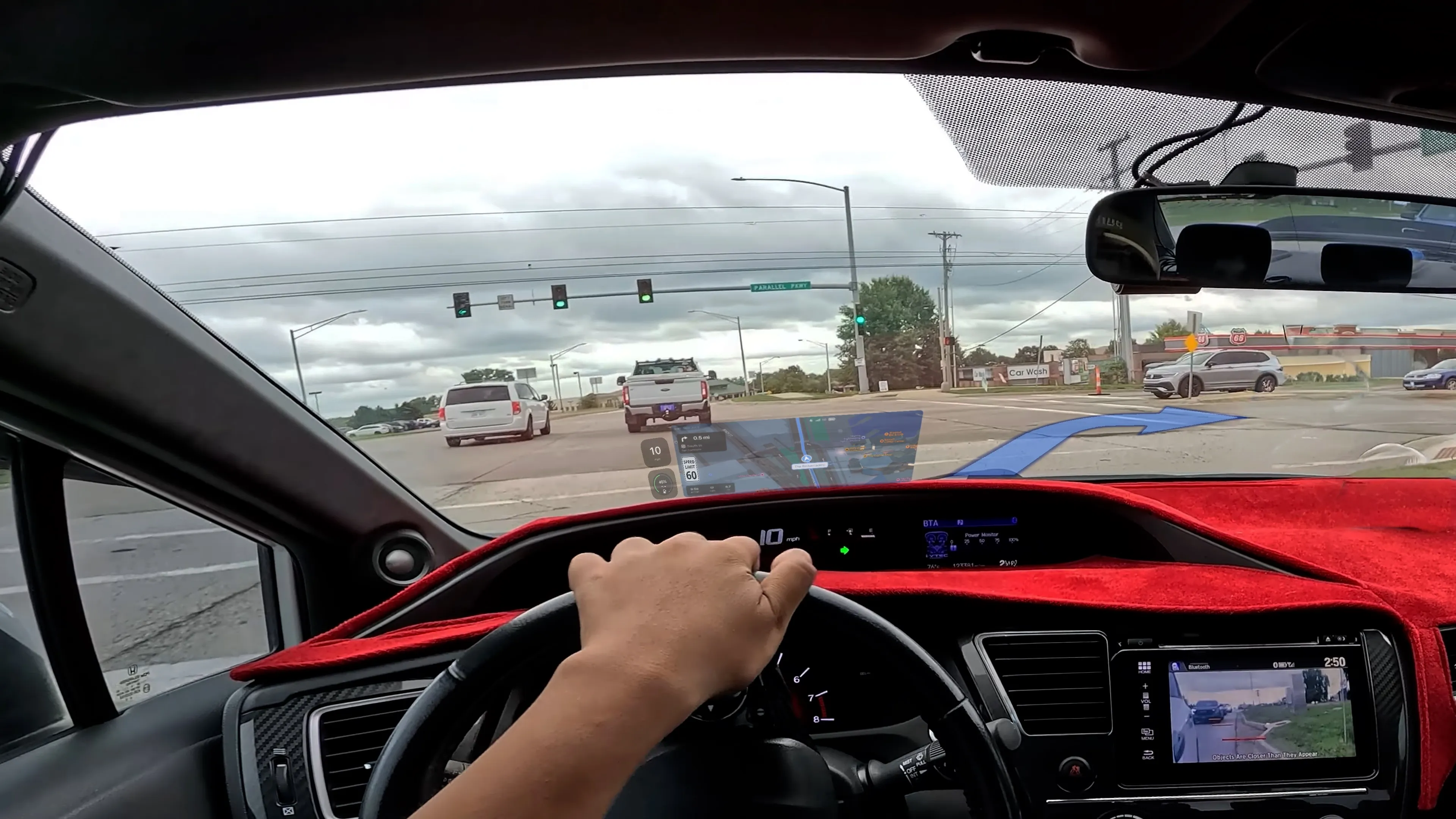
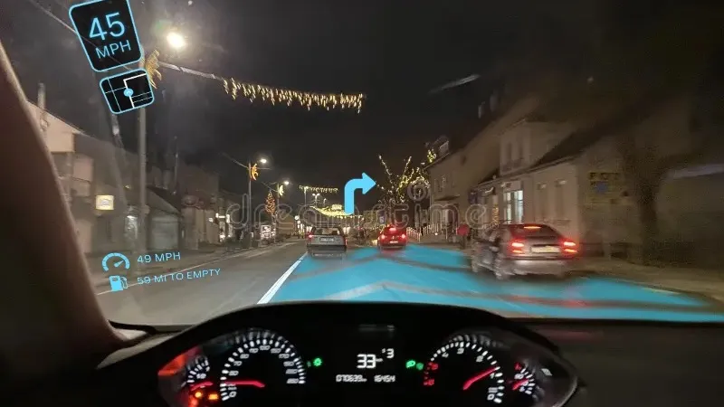
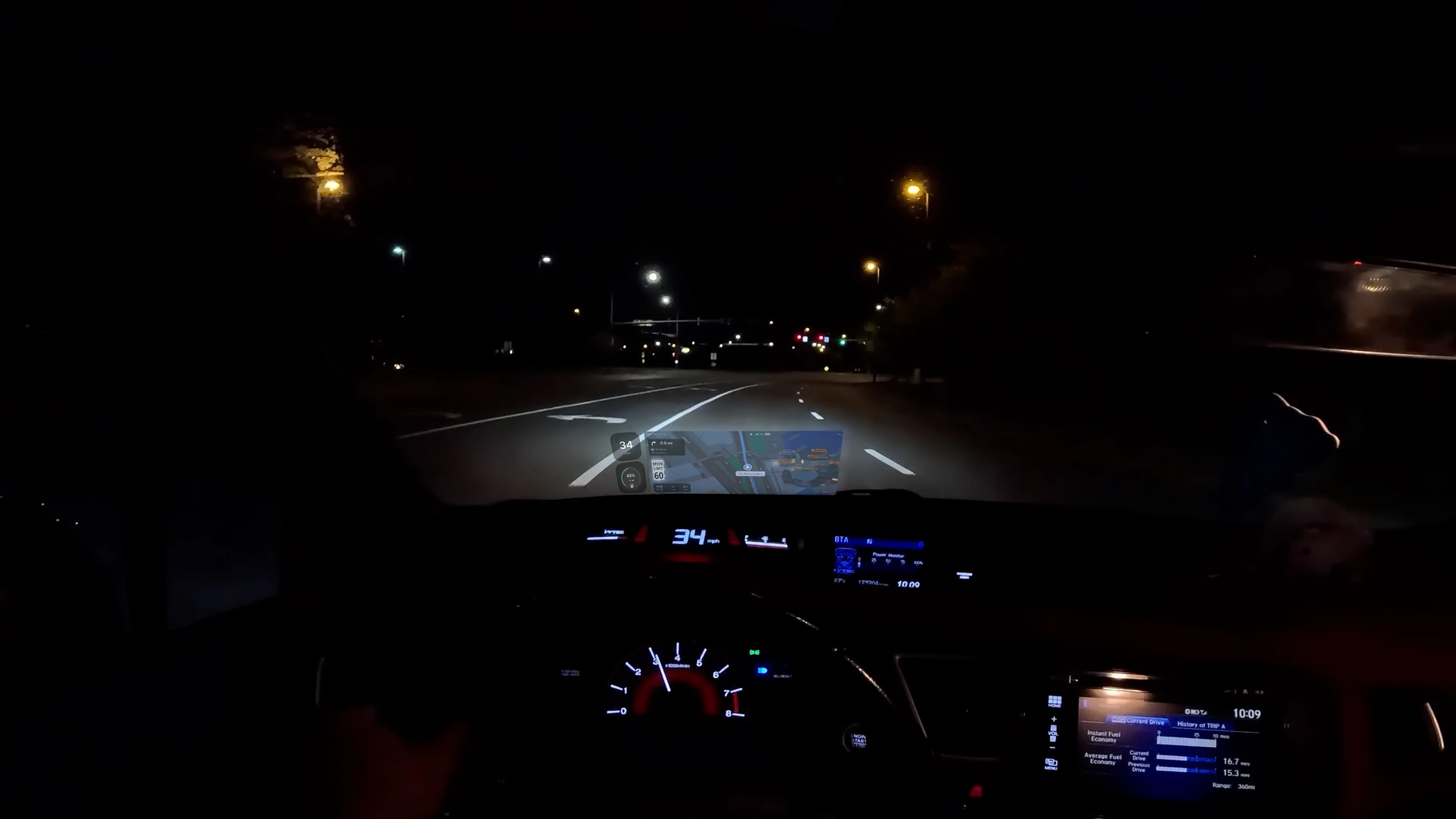
Concept A used bold glowing arrows and heavy graphics, meant for poor visibility. Concept B, which I designed, stayed closer to CarPlay, with subtle lane highlights and small widgets. We varied the density and contrast between them on purpose, so the evaluation could tell immersion and distraction apart.
04 Synthesis
What the simulator showed
Each in-person session ran the same unfamiliar route twice. The first time, participants had only a static photo map, and they had to ask for it out loud every time they wanted to look, which stood in for the effort of picking up a phone. The second time, they had AR overlays drawn on the windshield.
0 of 5 → 5 of 5
Route completion, map-only condition then AR overlay
Nobody finished the route with the map. They took wrong turns, doubled back, and called the whole thing confusing and stressful, and some asked for the map more than thirty times in a single drive. With the overlay, all five finished, usually in four to six minutes, and said it was easy.
I missed the exit because I was looking down at the phone.
P4, remote interview
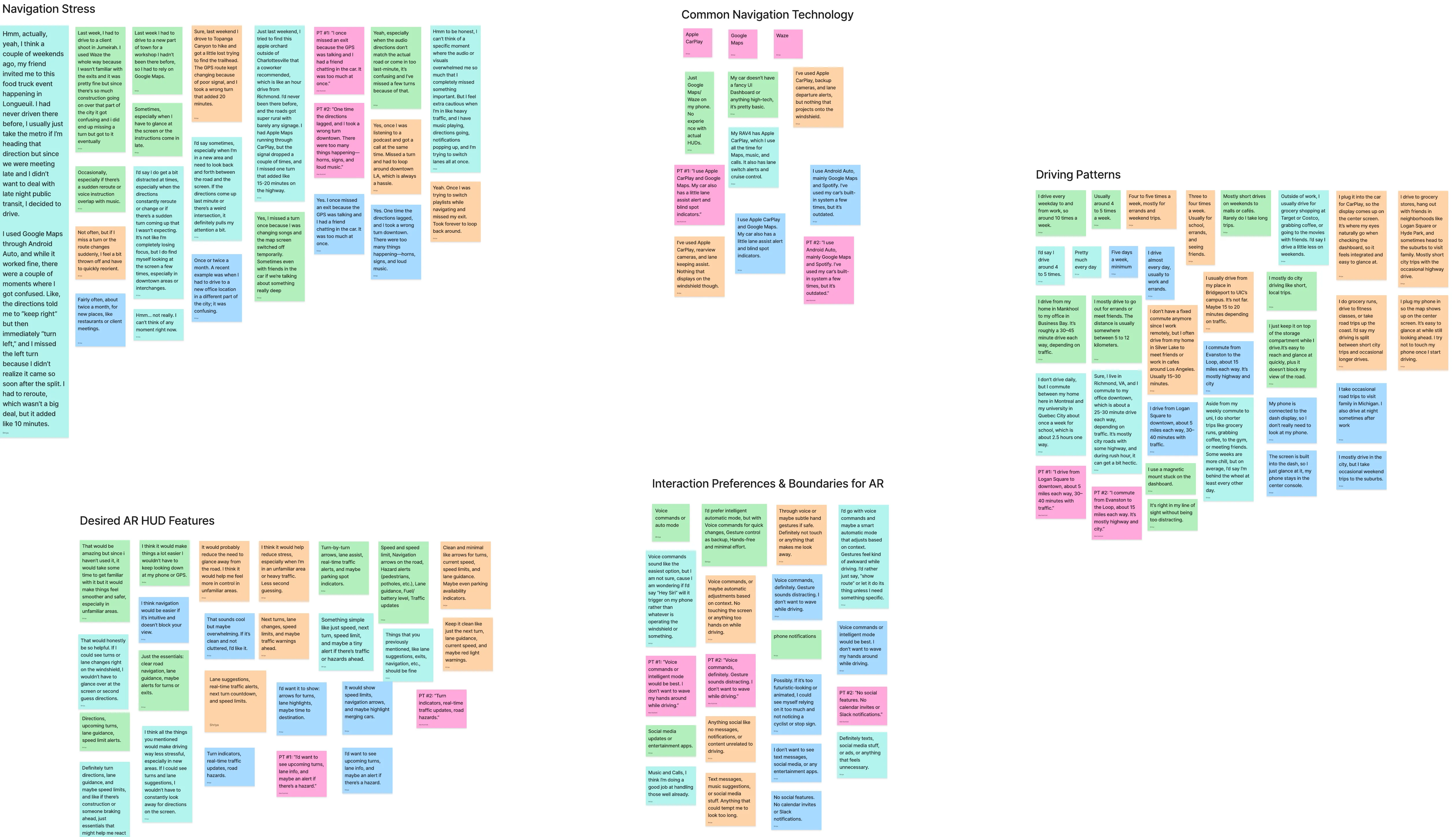
The interviews raised something the simulator could not test. Participants said they would trust AR guidance over a phone if it turned out to be reliable, and then they qualified it. The overlay has to be accurate and on time. Anything too animated or too busy could hide the road signs and people behind it. They also said outright that drivers might come to rely on it too much, and a few worried that someone watching the overlay would stop watching the road.
That is the part of our third question one session cannot answer. We could measure whether somebody finished the route. We could not measure whether they would still be watching the road properly after six months of using it.
05 Recommendation
What this means for anyone shipping an AR HUD
Most participants preferred Concept B for everyday driving. They said it was calmer and less distracting. A smaller group preferred Concept A in rain or fog, where the bold arrows felt reassuring rather than excessive. Several people wanted a system that changes how much it shows depending on the conditions, instead of picking one setting and staying there.
Turn guidance and lane clarity belong at the top of the hierarchy, sitting where the driver is already looking. ETA and speed can stay quiet underneath. Anything that is not about driving should be left out.
| Principle | Rule |
|---|---|
| Minimal but effective overlays | Arrows, lane highlights, and speed limits only. Density adapts to driving context. |
| Placement and hierarchy | Natural line of sight. Turn guidance and lane clarity first; ETA and speed secondary and subtle. |
| Prioritized features | Lane guidance, glowing path, and speed limit are core. Hazard alerts and mode-switching optional. Social, messages, and non-driving notifications excluded. |
The work produced a 78-page report (opens in a new tab), a 36-slide presentation (opens in a new tab), a configured simulator environment, and two evaluated concepts. The main limitation is that a simulator is only ever an approximation of driving. Three things follow from that. On-road testing in real traffic and bad weather, where trust gets built or lost over months rather than in one session. Adding audio guidance, so the overlay is not carrying everything on its own. And letting drivers set their own density, because the people who disagreed about it mostly wanted to decide for themselves.